
A few days ago, I got the new Facebook layout. At first, I was happy, but then I became unhappy.
The new Facebook UI is clean and simple, as one has come to expect from Facebook.
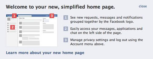
I’m sure they discussed this over and over internally, but the new design seems to violate some basic UI rules. The kind that usually, Facebook is a bastion of.

The rule is simple – don’t put destructive actions near non-destructive actions. Or more modestly, wherever possible lower the risk of click-error for the user.
Facebook has put its new status icons right next to the logo. Clicking on a status icon (friend requests, mail, notifications) reveals a contextual menu. Clicking on the logo whisks you back to the homepage. I wonder how many users are going to mistakenly end up at the homepage when all they wanted to do was view a new friend request.